


I then searched http://www.1001fonts.com/ for a suitable font for "Three Days Later". I ended up deciding on a font similar to that used in a comic. I believe that this font implies that this font makes the band look "fun"; this font also compliments the models used as they aren't looking very serious. I've placed the text in the centre of the page as this will make it clear to the reader who the models are.

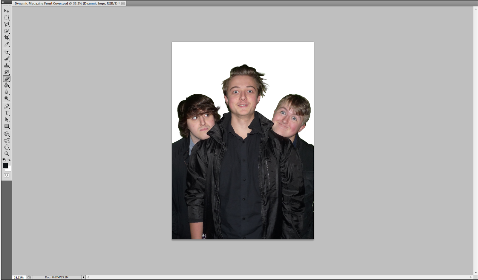
I then added a quote under the title which relates to the article. The white compliments the black clothing of the models very well, making it easily stand out.

I decided to use some rock bands who I researched earlier and some stories that a currently surrounding them. Using the white and the same green as the title, I was able to create some intriguing headlines.

I then created an issue number, issue date and price to the top corner of the magazine. The price was chosen via the results of my questionnaire. The black text used allows the text to stand out enough for people to easily read despite the small size of the text.

Next, I added a barcode to the bottom right of the page. I decided to add a barcode the the front cover of my magazine as this was a common convention of rock magazines.

I've decided to add more text on the right half of my page, this is because there was a large amount of space which I believe was a good spot for more headlines.

So far this is my front cover, for now I believe it is complete but I may edit it in a few days if any of my opinions towards it change.
No comments:
Post a Comment