Now that I have the upper half of my page completed, I can now add my text to the bottom half.
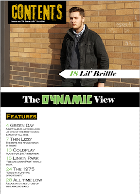
I've continued to use black boxes with yellow text for the headings of this page as this will give me a house style. The font I've used for the text is very simplistic as this is much more appealing to the audience as it spaces out the words and is not cluttered. In addition to this I've continued my trend of having my page numbers as the same light green used in all of my magazine.
After writing up my features, I had to include other segments to this content page other than just features. I ended up using Albums, Win!, and Gigs as these break the columns up nicely.
Sunday, 18 December 2016
Friday, 2 December 2016
Contents Page Progression Part 2
Now that I have written the features that I will have on my page, I can now present them nicely on my page.
I've decided to call this artist Lil' Brittle. I've used green for the page number here which I will use throughout my magazine in order to have a house style.
From the magazine's I've researched, they had some form of line which sectioned off parts of the page. I've created a black bar in order to include this convention. The white text on the black background has once again been used on this page. The "Dynamic" used here is the same font and colour as my title on my front cover; I did add an outer glow to it as to make it stand out from the black background more.
Thursday, 1 December 2016
Contents Page Progression Part 1
So I started by taking some photographs of a model similar to the models on my front cover,
This photo was taken at a medium shot and is taken from a landscape angle in order to fit well with the flat plans I've previously drawn up.
I began by creating a page which was 20.5cm by 28.5cm. Next I inserted my image into the document and placed it accordingly, ensuring that the graffiti and the post were in frame.
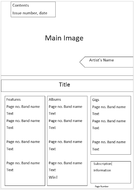
I wanted to create a title on page to clearly show that this is the contents page. I also wanted to use black and yellow as they contrast very well.
Using the rectangle tool, I was able to create a black rectangle for my yellow title to be in. I used a font website to get the font I've used for 'Contents'. This font is similar to that of the types of fonts used in magazines I researched such as Kerrang!
An, extremely important convention of any magazine is an issue number and date. I've used white text on the black background as they work very well together.
Finally, I've added a white arrow using the rectangle tool and line tool. This is what I will write the name the artist.
Monday, 28 November 2016
Front Cover Progression (Day 2)
I then opened a new Photoshop document and set the dimensions to Height: 28.5 cm, Width: 20.5 cm and Resolution: 72 pixel/cm. I then used the Paint Bucket Tool and a new layer to create a white background.
Next, I used the Rectangle Tool to create a black bar at the top of my page; I plan on using this to advertise on of the most eye-catching pieces of information to the reader.
I decided to use the black bar as a way to advertise "Two free albums" to the reader. I believe that by using white text on a black background, this will be one of the first things the reader sees when looking at my magazine.
Using the font and name that my survey voted for, I created a main title for my magazine. I decided that the light green used, gives my title stand out very well as it is very noticeable, yet not too harsh on the eyes.
I then searched http://www.1001fonts.com/ for a suitable font for "Three Days Later". I ended up deciding on a font similar to that used in a comic. I believe that this font implies that this font makes the band look "fun"; this font also compliments the models used as they aren't looking very serious. I've placed the text in the centre of the page as this will make it clear to the reader who the models are.
I then added a quote under the title which relates to the article. The white compliments the black clothing of the models very well, making it easily stand out.
I decided to use some rock bands who I researched earlier and some stories that a currently surrounding them. Using the white and the same green as the title, I was able to create some intriguing headlines.
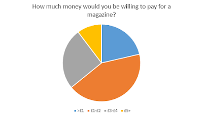
I then created an issue number, issue date and price to the top corner of the magazine. The price was chosen via the results of my questionnaire. The black text used allows the text to stand out enough for people to easily read despite the small size of the text.
Next, I added a barcode to the bottom right of the page. I decided to add a barcode the the front cover of my magazine as this was a common convention of rock magazines.
I've decided to add more text on the right half of my page, this is because there was a large amount of space which I believe was a good spot for more headlines.
So far this is my front cover, for now I believe it is complete but I may edit it in a few days if any of my opinions towards it change.
Wednesday, 23 November 2016
Front Cover Progression (Day 1)
I started off by taking photos using a camera and tripod with a green screen for the background as that would make it easier to edit out the background of my models later.
I imported this photo into Photoshop after deciding between two other photos, however I believe that this photo is the most suitable for a rock magazine front cover.
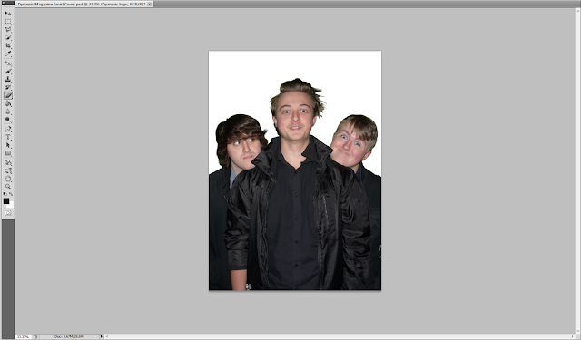
I began editing the photo by using the Quick Selection Tool. This allowed me to easily specifically select my models. By using the green screen, the job of only selecting my models was very simple.
I then used the Masks tool as well as inverting the mask in order to remove most of the green screen in the background.
Next, I used the Refine Edge function as well as the Smart Radius function in order to delete even more of the green. The green on the image was a problem as my model's hair was very thin, yet noticeable if I deleted these strands of hair from the model as shown below:
I've decided to go ahead and use the Blur Tool and the Smudge tool in order to attempt to get rid of some of the green.
I used those two tools, as well as the Eyedropper Tool and the Brush Tool in order to change some of the green into hair as simply erasing some of the hair was not an option.
I imported this photo into Photoshop after deciding between two other photos, however I believe that this photo is the most suitable for a rock magazine front cover.
I began editing the photo by using the Quick Selection Tool. This allowed me to easily specifically select my models. By using the green screen, the job of only selecting my models was very simple.
I then used the Masks tool as well as inverting the mask in order to remove most of the green screen in the background.
I've decided to go ahead and use the Blur Tool and the Smudge tool in order to attempt to get rid of some of the green.
I used those two tools, as well as the Eyedropper Tool and the Brush Tool in order to change some of the green into hair as simply erasing some of the hair was not an option.
Tuesday, 22 November 2016
Thursday, 17 November 2016
Wednesday, 16 November 2016
Tuesday, 15 November 2016
Monday, 14 November 2016
Flat Plans for Front Cover
I've decided to do a flat plan for my magazine, 'Dynamic'. The plan that I have created, seems to fit the common conventions of other popular music magazines. I believe that this design will give my magazine an edge as it is not cluttered like some music magazines. This approach which is not too simplistic. This will be the best approach to creating a music magazines as most 'cluttered' magazine front covers seem be too harsh on the eyes and not look very professional. My questionnaire also indicates that my target audience should be 26-30 years old, this implies that I should keep the magazine from becoming too cluttered in order to be most appealing to this age group.
Wednesday, 9 November 2016
Magazine front cover planning
Since I have decided I want to have three members to my band 'Three Days Later', I have went ahead and researched other popular rock music magazines such as RollingStone and Kerrang!
This magazine contains three members of Biffy Clyro for the front cover models. The three members have quite serious expressions. There is a basic grey background, this has been used to highlight the three models; this also makes the ginger hair of the models stand out well. The dress-code for these models seems to be smart-casual, this keeps the band from looking too formal which will allow the audience to gain a sense of personal identity as they can relate to the models.
This magazine contains three members of Biffy Clyro for the front cover models. The three members have quite serious expressions. There is a basic grey background, this has been used to highlight the three models; this also makes the ginger hair of the models stand out well. The dress-code for these models seems to be smart-casual, this keeps the band from looking too formal which will allow the audience to gain a sense of personal identity as they can relate to the models.
This magazine contains the members of Rush for the front cover models. These three have a more happy expression than the previous cover. The photo is a medium close up, which allows all of the members to by in the photo; it is also staged as the members aren't in a very natural pose. The solid white background makes the dark clothing stand out very well and highlights the three band members.
Saturday, 29 October 2016
RollingStone Reader Profile
The typical RollingStone reader is a single 25 year old male, who earns roughly $60,000 per year and enjoys listening to rock music. This reader enjoys being up to date with all the goings on within the world via social media. This is usually used as their platform for them to express their opinions about their favorite musicians.
Friday, 14 October 2016
Thursday, 13 October 2016
Reader Profiles
The reader of Dynamic magazine is of the young male demographic. They enjoy all forms of social media and an avid music listener. They like coming home from a long shift and chilling out with friends and listening to a good playlist. Dynamic's readers show a keen interest in rock music and have many songs, whether its in the form of a playlist on their phone, or a collection of CD's. If they're not at home our readers are experiencing the time of their lives at sold out gigs and enjoys other live events.
Tuesday, 11 October 2016
Questionnaire Results
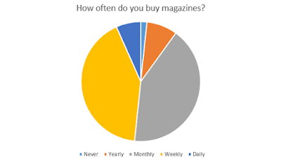
This kind of audience research is important as it allows producers to find out exactly what their audience wants. This allows producers to change their products so that they are better for their audience.
Monday, 10 October 2016
Sunday, 9 October 2016
Tuesday, 4 October 2016
Monday, 3 October 2016
Friday, 30 September 2016
Thursday, 29 September 2016
Common Conventions and Trends
Recently, I have discovered a YouTube video by the name of "The Millennium Whoop". This video has taught me that throughout all aspects of the music industry there are many lots of ideas which are reused as these bode well with audiences. The Millennium Whoop is an example of this. A similar processes are carried out when creating a music magazine including the likes of a house style and a contents page.
Monday, 26 September 2016
Wednesday, 21 September 2016
"The Grange", School Magazine
I have created a front cover and contents page for a magazine about my school.
I began by taking photographs of myself and other students within the school. I was then able to manipulate the photos using Photoshop in order to create the magazine I had in mind. I was able to add multiple subheadings and titles, as well as use a series of different fonts, colours and sizes on my text. I decided on using a similar shade of blue for my subheadings as to that of the sign in the main image, this allowed my front cover to contain a house style whilst also making the text stand out from the background. I did this whilst also following and using many key conventions of other magazines like the one I wanted to create.
For my contents page I used a medium-long shot as this allowed me to show off the style of clothing that is expected upon entering sixth form. I also decided to use a house brand colour of yellow and blue as these are the colours of the school's logo.
Friday, 19 August 2016
Post 16 Introduction
Hi, I'm Keiran and this is going to be my blog whilst I study my A-Levels at Heworth Grange. I decided to take Physics, Psychology, and Media and I hope to leave Heworth with a good set of results in 2018.
Subscribe to:
Comments (Atom)
